Landing pages are the first pages you see when clicking an ad or link. They are not random; they have a goal—to make visitors do something. This could be anything from joining a newsletter and getting a book to buying something.
Think of landing pages as the online shops that attract your visitors to look around and, more importantly, take action. They are not just pretty—they help you get more customers, more sales, and more growth for your business.
On the internet, landing pages are like your friendly guides, leading visitors to good experiences and helping you succeed online.
Now, the big question: How do you make landing pages that work? What are the proven ways and smart tips to make sure your landing pages are the best they can be? Don’t worry!
In this blog post, we will answer these questions, share the best practices, and give you tips that will help you make landing pages that work very well. To back up our advice, we will also add some numbers and show you examples of landing pages that did a great job. Get ready to learn the secrets of successful landing pages!
What Makes a Good Landing Page?
A great landing page has these important things:
Relevance
It matches the ad or link that brought the visitor there, making the experience smooth and consistent. A relevant landing page meets the visitor’s needs and keeps the promise of the ad or link.
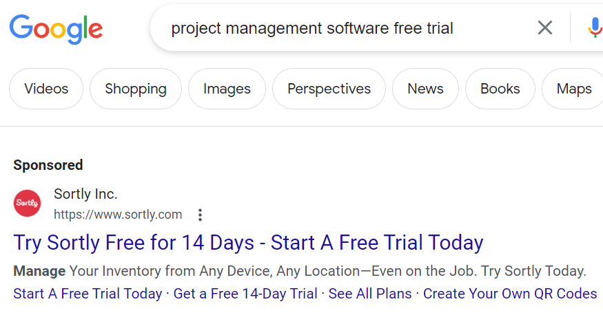
For example, if your ad offers a free trial of your software, your landing page should tell how to sign up for the trial and what good things it gives. A relevant landing page also uses the same words, phrases, and pictures as the ad or link, making the message clear and keeping the visitor on the page.
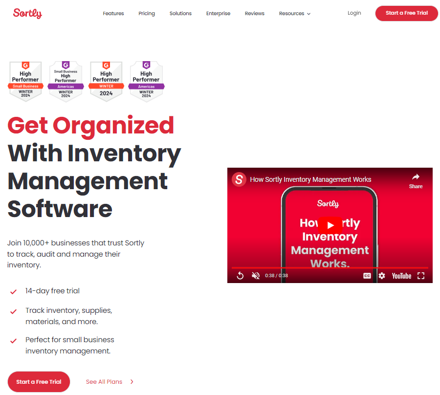
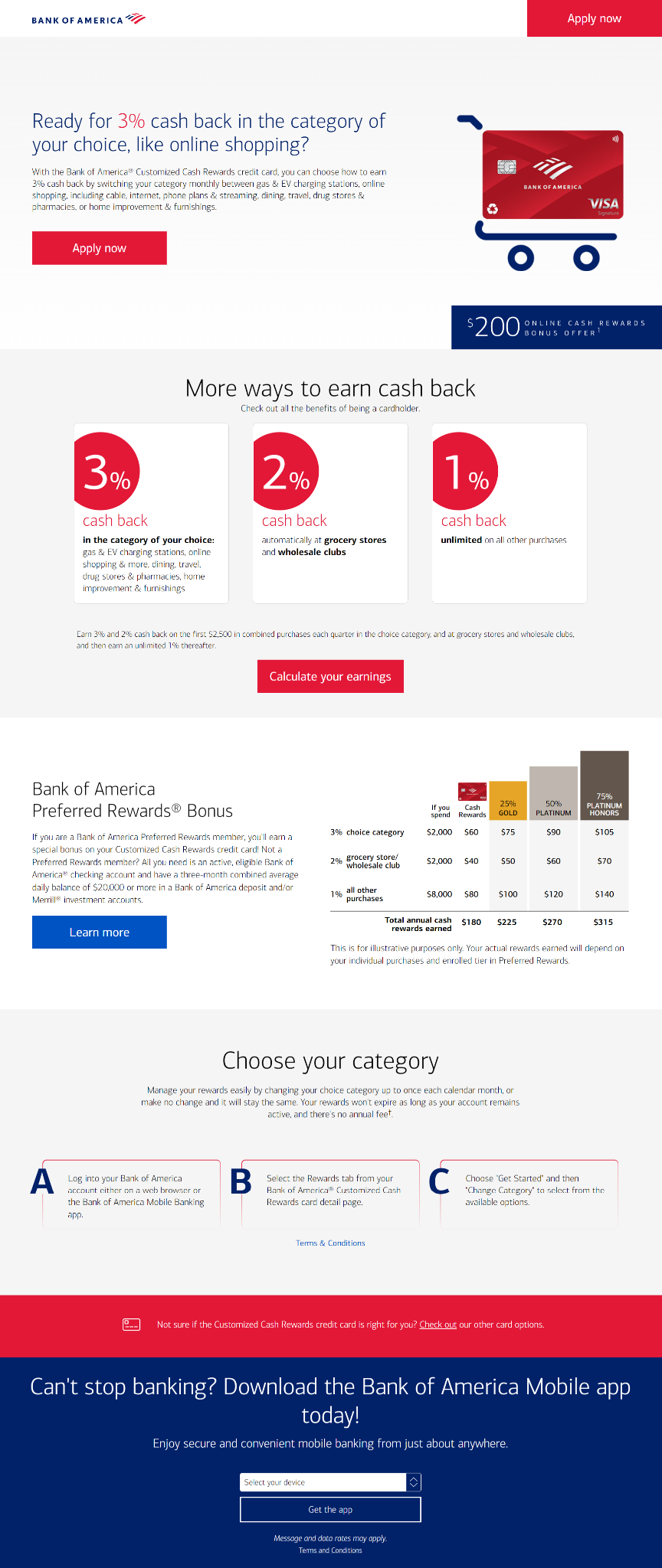
Here’s an example of showing an ad for a free trial of a project management software Sortly and its landing page:
Sortly Ad
Sortly Landing Page
Clarity
It provides information about the offer or value clearly and briefly, without confusing the visitor. A clear landing page uses easy and straight language, points, headings, and subheadings to tell the main things about the offer or value.
It also avoids a large lexicon (stick to 8-10 grade reading level, avoid using words like a lexicon), technical terms, or unclear statements that might confuse or distract the visitor. A clear landing page answers the questions of who, what, why, and how, and makes it easy for the visitor to understand the good things and features of the offer or value.
Navigation
Your landing page should have a clear and simple layout that lets your visitors find what they want quickly and easily.
A good landing page has very few links, buttons, menus, and other things that might take the visitor’s attention away from the main goal of the page. However, it is also important to mention here that all the options it has may be chosen with accuracy. It also uses space, contrast, color, and font size to show the most important things and guide the visitor’s eyes.
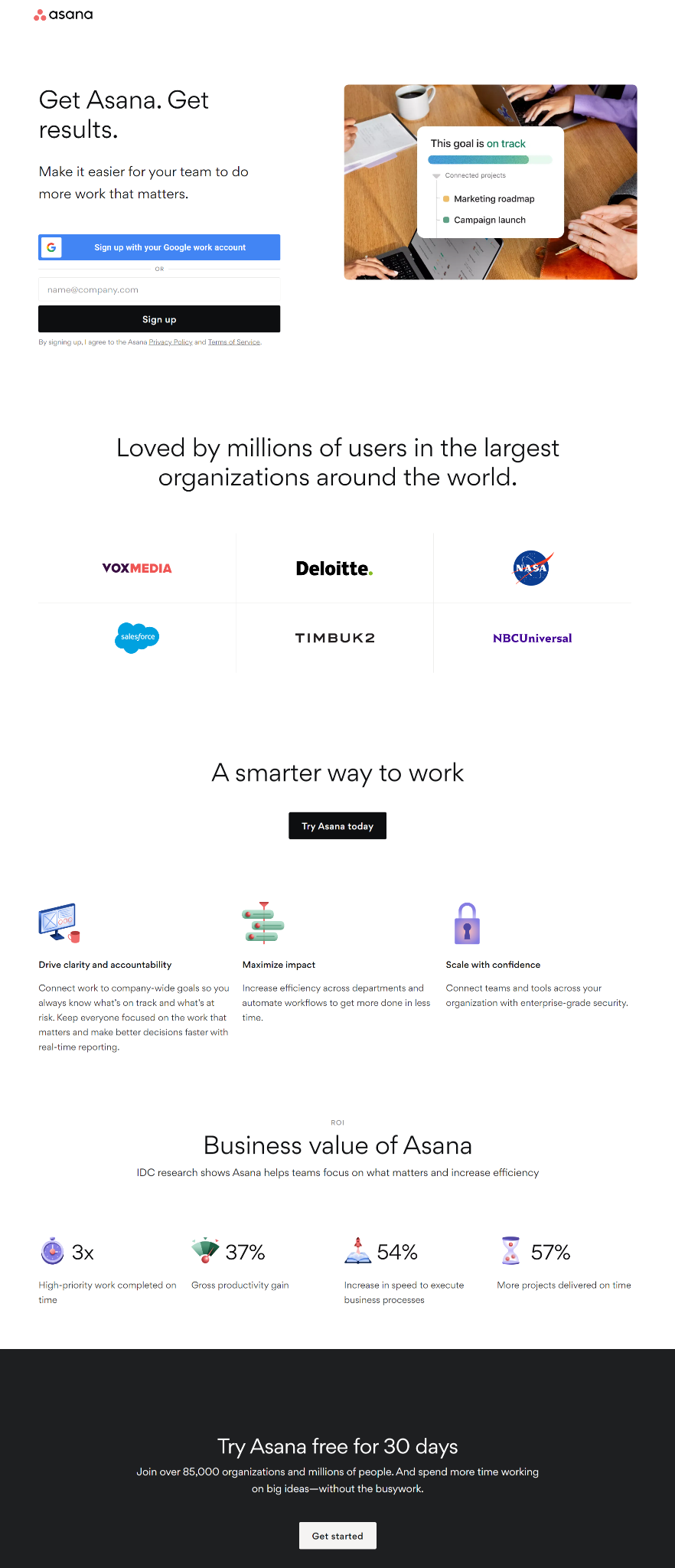
Have a look at the Asana landing page a perfect example of a page with clear and concise navigation:
It should also give clear and easy navigation options, such as a back button, a call-to-action (CTA) button, a progress bar, or a breadcrumb trail, to help the visitor move around the page and do the desired action.
Design Merits
Having a design that not only catches the eye but also matches the overall brand, making it both nice-looking and brand-consistent. It uses a professional and attractive design that shows the personality and values of the brand.
It also uses a consistent color scheme, logo, typography, and imagery that match the brand’s style and tone. A good landing page also makes the best use of visual elements, such as pictures, icons, illustrations, or animations, to support the message and make the visitor feel something.
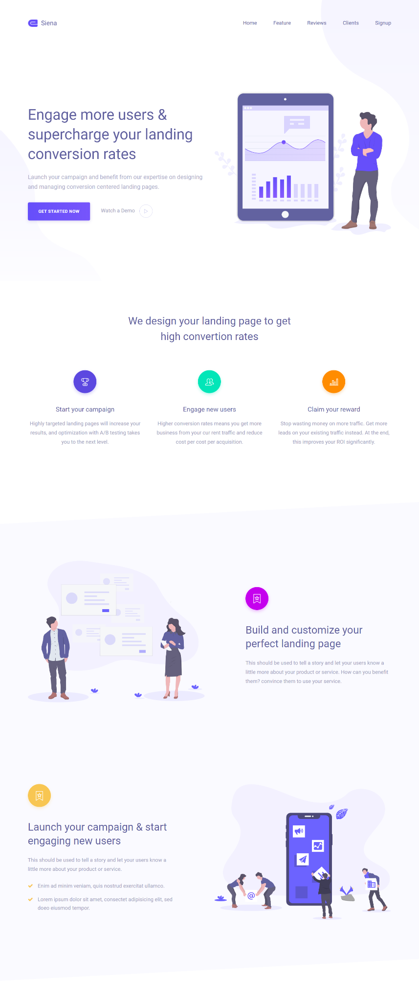
Such a page also follows the rules of visual order, balance, alignment, and symmetry, to create a beautiful and pleasing layout.
Speed and Mobility
Making sure fast loading times and good functionality, especially on mobile devices, serve the different ways visitors use the internet. Such a page loads fast and works well on any device and browser, giving a smooth and hassle-free experience for the visitor.
It should also use a responsive design, which changes the layout and content to fit the screen size and orientation of the device.
Such a page also follows the best ways of web performance, such as making images smaller, making code simpler, saving resources, and using a content delivery network (CDN), to make the loading time shorter and improve the user experience.
Compelling Call-to-Action (CTA)
A strong, visible CTA that tells visitors what to do next, giving them a clear direction on what action to take. A good landing page has one and only one CTA that matches the goal of the page and the visitor’s intention.
Right CTA uses action words and convincing language, such as “Start your free trial”, “Download now”, or “Get instant access”, to make the visitor take action. A good CTA also uses a different color, size, shape, and place, to make it stand out from the rest of the page and draw the visitor’s attention.
Have a look at Kajabi’s landing page with compelling CTAs:

A good CTA also gives a clear and compelling value, such as a discount, a bonus, a guarantee, or a testimonial, to overcome the visitor’s doubts and increase the chance of conversion.
How Do You Measure Your Landing Page Performance?
To evaluate how well your landing pages are performing, you need to track some key metrics and indicators. Some of the most important ones are:
Conversion rate
It’s the percentage of visitors who successfully carry out the intended action on your landing page. This is usually a form signup or a sale if it’s an e-commerce site. For instance, if 100 visitors click on your ad and then 10 proceed to sign up for your newsletter, your conversion rate would be 10%.
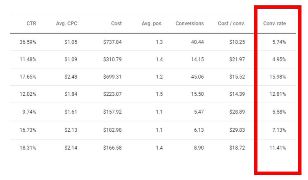
Now, as a point of reference, HubSpot notes that the average conversion rate across all industries hovers around 5.89%. So, when assessing your landing page’s effectiveness, keep an eye on that conversion rate—it’s a key metric indicating how well your page is turning visitors into active participants.
Traffic Sources
It’s essentially a way of understanding where your visitors are coming from. You can tap into tools like Google Analytics or other similar platforms to dissect the channels that are steering the most traffic to your landing pages.
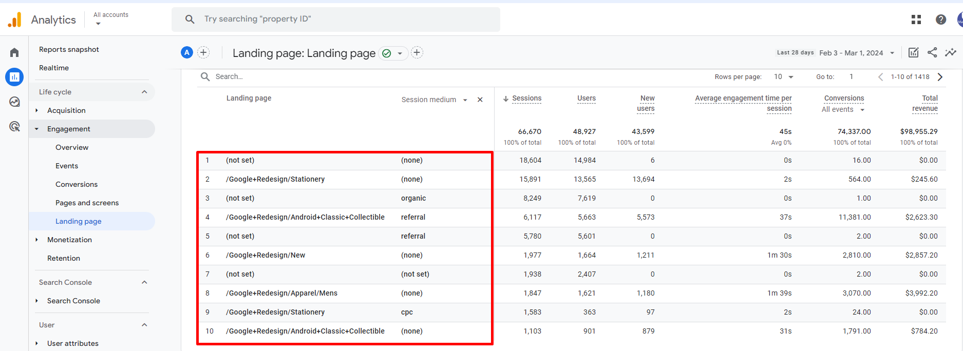
This could include a variety of sources like organic searches, paid advertisements, social media, or even your email marketing efforts. By unraveling the mystery of your traffic sources, you gain insights into which channels drive the influx of visitors to your landing pages.
Bounce rate
It’s the percentage of visitors who bid farewell to your landing page after checking out just one page. If you find yourself facing a high bounce rate, it’s like a red flag signaling that your landing page might be missing the mark in terms of relevance or engagement for your visitors.
For context, HubSpot highlights that the average bounce rate across all industries hangs around 65%. So, when you’re evaluating your landing page performance, keep an eye on that bounce rate—it’s a valuable indicator of whether your page is hitting the right notes to keep visitors intrigued and invested.
Time on page
This gauge essentially tells us how much time visitors invest in exploring your landing page before making their exit. When you see a longer time on the page, it’s a positive signal—it indicates that your visitors are genuinely engaged and finding value in what you’re offering.
To put things into perspective, HubSpot shares that the average time on a page across all industries clocks in at 2 minutes and 37 seconds. So, when you’re assessing your landing page’s performance, keep an eye on that timer—it’s a valuable indicator of whether your content is holding your audience’s attention and resonating with them.
Pages per session
This metric sheds light on the number of pages visitors check out during their time on your website. A higher count of pages per session is a positive sign—it indicates that visitors are delving into more of your content and discovering compelling reasons to stick around.
As a reference point, HubSpot notes that the average number of pages per session across all industries stands at 3.5. So, when you’re evaluating your website’s performance, keep an eye on this metric—it’s a valuable insight into how deeply visitors are engaging with your content and exploring what your site has to offer.
How Do You Improve Your Landing Page Experience?
Enhancing your landing page experience and boosting conversions involves a bit of experimentation. To figure out what resonates best with your audience, it’s all about testing different elements on your landing page.
Tools like Google Optimize or Unbounce can be your trusty allies in this quest. With these tools, you can conduct A/B tests or multivariate tests, essentially comparing and analyzing variations of different elements on your landing page to see what clicks with your audience and drives better results.
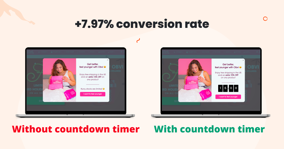
It’s like fine-tuning your approach based on real-time feedback from your audience, ensuring that your landing page becomes an optimized powerhouse for conversions.
Some of the common elements that you can test are:
Provide Relevant, Useful, and Original content
Attention Grabbing Headline
It’s the very first impression your landing page makes on visitors. Its job is crucial: to grab attention instantly and convey the primary benefit of what you’re offering. Think of it as the opening statement that sets the tone for your entire landing page, aiming to captivate your audience and clarify why your offer is worth exploring.
Below is a perfect example of the attention-grabbing headline from the Canva’ss photo editor landing page:
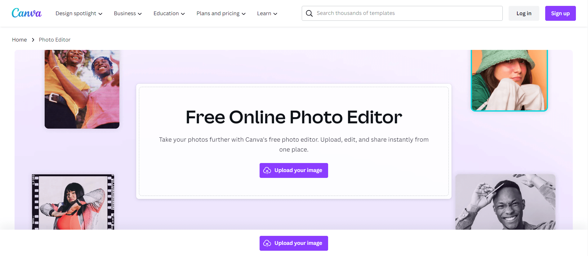
So, when crafting your headline, remember that it’s the gateway to your message, and its impact can be a game-changer in drawing visitors into what your landing page has to offer.
Well-crafted Subheadline
A nice, optional thing that goes along with your headline. Its job is to go a bit deeper, giving more details or background about what your offer is about. Think of the subheadline as the helper to your headline, adding more information that helps visitors understand the details of your offer.
While not required, a well-written subheadline can be a great partner to your headline, making sure that your audience gets a complete and convincing overview of what’s waiting for them on your landing page.
Create a compelling tale
The text content is very important for telling what you’re offering and why it’s important for your visitors. It’s the story told on your landing page, showing the value and helping your audience with the features of your offer.
Your copy is like the storyteller, making an interesting story that connects with your audience and tells them not only what you offer, but why it matters. So, when you’re writing your copy, think of it as the voice of your landing page, talking directly to your visitors and leading them on the journey to discover and appreciate the value of what you offer.
Use a compelling CTA
Your landing page should have one and only one call-to-action that matches the goal of the page and the visitor’s intention. Your CTA should use action words and convincing language, such as “Start your free trial”, “Download now”, or “Get instant access”, to encourage your visitors to take action.
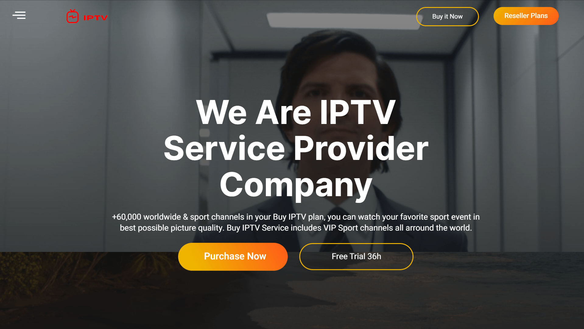
The CTA should also use a different color, size, shape, and place, to make it stand out from the rest of the page and catch your visitors’ attention. It should also give a clear and compelling value, such as a discount, a bonus, a guarantee, or a testimonial, to overcome your visitors’ doubts and increase the chance of conversion.
Optimize the Design and Functionality
Color scheme
Color Schemes can change how visitors see and feel about your landing page. Colors have an emotional meaning, and the mix you choose can make specific feelings or reactions.
It’s like choosing the mood for the whole page. Warm colors may create a feeling of energy and warmth, while cool colors might create a calm and relaxed atmosphere. So, when thinking about your color scheme, think of it as a quiet speaker, gently guiding your visitors’ feelings and making their experience better on your landing page.
Layout
Layout is important because it keeps everything in place. It makes it easy for visitors to move and learn information from different parts of your landing page. Think of it as the plan that decides the order of things, making a smooth flow for your audience.
A good layout helps visitors scan and read the content, without making them feel too much or lost. It’s like the design director, arranging the visual things in a way that makes readability better and leads visitors through a nice and interesting journey on your landing page.
Navigate
Your landing page should have a clear and simple layout that lets your visitors find what they want quickly and easily. You should also have a few things, such as links, buttons, menus, or pop-ups, that might take your visitors away from the main goal of the page.
You should also give clear and easy navigation options, such as a back button, a progress bar, or a breadcrumb trail, to help your visitors move around the page and do the desired action.
Use Relevant visual elements
Image
An optional but strong thing that works with your headline is to show your message with pictures. You don’t have to use it, but an image can show what you’re offering, making your headline more interesting. It’s like making your words real and giving visitors a look at what they can get.
So, think of the image as a helpful friend in making your landing page better, adding a picture part that can catch and connect with your audience.
Videos
It makes your landing page more engaging and interesting. Videos go beyond the still nature of text and images, showing how you give value with real-life examples. It’s like bringing your visitors into a story, letting them see your offering in action, and making a closer connection.
So, when thinking about using videos, think of it as a strong tool to not only tell information but also to involve your audience in an exciting and interactive experience that makes your landing page deeper.
It needs careful research, planning, testing, and improvement
Having a well-crafted landing page is an effective marketing strategy that can help your business grow by getting more leads and more sales. But, to use these pages well, you need more than just a simple approach.
Making effective landing pages is a process that needs careful research, planning, testing, and improvement. Visitors aren’t dumb. They’ve been bombarded with social media and other forms of online advertising in the last 25 years. A careful and genuine message is key. It’s a strategic journey where each thing is well-chosen and improved to make a smooth and convincing experience for your visitors, helping you achieve your business goals.
In this post, we’ve given you a mix of helpful numbers and tips to help you understand the details of a great landing page experience. We hope that these pieces of information have been helpful and informative, giving you useful insights to improve your knowledge of what makes a successful landing page. Click here to see what we at Eyeuniversal can do for you!
References:
- https://blog.hubspot.com/marketing/landing-page-stats
- https://blog.convrrt.com/landing-page-statistics/
- https://truelist.co/blog/landing-page-statistics/
- https://school4seo.com/google-ads-search-advertising-exam/which-attributes-describe-a-good-landing-page-experience-select-all-correct-responses/
- https://www.apexure.com/blog/which-attributes-describe-a-good-landing-page-experience/
- https://unbounce.com/landing-pages/which-attributes-describe-a-good-landing-page-experience/
- https://www.plerdy.com/blog/which-attributes-describe-a-good-landing-page-experience/
- https://janinedesignsdaily.com/which-attributes-describe-a-good-landing-page-experience/

